Table of Contents
- Summary
- First Impression
- Descriptive Analysis (User Experience Analysis)
- Future Steps
- References
Summary
ClickFunnels is a very innovative website that helps you to sell products online. The website has a clear mention of what it does at the top, followed by a very descriptive videos. The website probably has enormous amount of users as it displays people who bought the services every minute or two. This has been a potential game changer in the e-commerce industry. The analysis provided here will enhance the user experience and potential benefits for the users which in turn increases the retention of the users. The benefits of user experience is mentioned in [1][2][3][4]
Alexa Rank : Global : 1607, USA : 768
First Impression
First impression of the website goes to the textual information. Especially, the visual eye looks the largest font that is
Abandon now your website for your business to survive.
However, user is able to understand the website by looking at the text below, which is mentioned above the text – Abandon….
Everything you need to market, sell and deliver your products online.
It is therefore recommended, to change the font and font size or reposition the text so that user is able to quickly look at the text that makes him/her realize what the website is all about.
Also, the website doesn’t have navigation links and information looks very cluttered. And, discovering the information is cumbersome for the user as he/she needs to scroll too much to know where the information is lying around. Therefore, it is recommended to have tabs that can provide easily navigational links to aid the discovery for the users. And also try to incorporate a search box to search the content. Following tabs are recommended.
- Home – Information regarding who we are, what we do and social cause donation, signup etc.
- Products – Details about the product offering viz different funnels etc.
- Tutorials – Different Videos regarding the use of clickfunnel. Educative material if any.
- Testimonials – Testimonials from different customers for each funnel type either through videos or text.
- FAQs – Frequently asked Questions
- Contact Us – Contact Details and Support Details.
Descriptive Analysis
Detailed analysis of the website is done based on the User Experience and presents the kind of challenges that the clickfunnel needs to address.
We have given the complexity level , category, and Issue Type of the tasks based on the understanding we have.
As you can see much of the issues are around consistency of information, logos, and user experience (though all are user experience)
Complexity
1 – easy 2- doable 3- doable with some efforts, 4- bit difficult with respect to design 5-difficult, time consuming with respect to content, structure
User Experience Analysis
Sl No : 1
Complexity : 3
Category : Design and Layout
Issue Type : Fonts
Issue : Fonts Size and Font can be made better
Resolution : The usage of Fonts has to be thought through in terms of size, color and type. It has to be elegant and should appeal the users
Sl No : 2
Complexity : 3
Category : Design and Layout
Issue Type : Ambiguity of Information
Issue :
- Enter the http://www.clickfunnels.com URL in the browser.
- click on Get your FREE 14 Day Trial Now! button
- It navigates to 14 Days FREE Trial! section
- click on ->Start FREE Trial Now! button.
- It will give you pop-up to create New account.
- Observe the pop-up
Actual Result: on this pop-up sort of status bar is displayed with text as “Almost complete…”- This is ambiguous as the account creation has just started and it appears it’s almost done
Resolution :
Expected Result/Resolution: We can enter/add user friendly messages like-
- X more steps to complete.
- Move the signup at the end when the user wants to buy or register or use it
- Keep the progress bar & move the same step by step when user enter values in the given fields
Sl No : 3
Complexity : 1
Category : Developer
Issue Type : Consistency of Information
Issue : Inconsistent Copyright on click funnel main page and login page. (Screenshot 1 & 2)
Resolution :Keep consistent Copyrights on all pages
Screenshot 1 :

Screenshot 2 :

Sl No : 4
Complexity : 1
Category : Developer
Issue Type : Consistency of Information
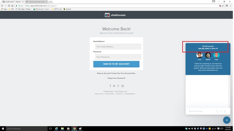
Issue : Chat Conversation on click funnel has different time on chat/conversation button on login screen and login main page. (Different message as Typically replies in 30 min and Typically replies under 5h for the same chat conversation) (Screenshot 3 & 4)Resolution : Keep the same text on both the places
Screenshot 3

Screenshot 4

Sl No : 5
Complexity : 2
Category : Developer
Issue Type : Consistency of Logos
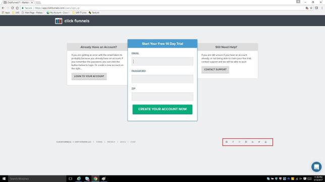
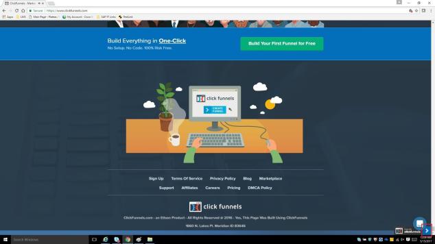
Issue : Logos of social websites are not consistent on the user sign in screen and new account sign up. Screenshot 5 & 6. Its absent on website’s main page.
Resolution : keep the social networking websites logo on all screens & those should be highlighted in such a way that user can easily access those.
Screenshot 5:

Screenshot 6

Sl No : 6
Complexity : 3
Category : Developer
Issue Type : User Experience
Issue : on the “CHAT WITH OUR GROWING SUPPORT TEAM!” section.put chat/conversation link/button(Screenshot 7)
Resolution : put chat/conversation link/button, to immediately start the conversation.
Screenshot 7:

Sl No : 7
Complexity : 3
Category : Design and Layout
Issue Type : Consistency of Information
Issue :Second section – On What Is sales funnel section. clickfunnel logo/icon is not seen, whereas it’s seen on other section. Clickfunnel logo is not consistent throughout the web-page.
Resolution : Clickfunnel logo should appear on all sections.
Screenshot 8:

Sl No : 8
Complexity : 3
Category : Developer
Issue Type : User Experience
Issue :
- Section under FAQ- Here are a few of our favorite integrations:
- Add Your Favorite Auto-Responder section-provide hyperlinks for autoresponders/shopping account (Screenshot 9)
Resolution : Use hyperlinks for autoresponders/shopping card as tool tip. This will help user navigate to particular sites. Make all company logo clickable so that it helps users to navigate to the website easily.
Screenshot 9:

Sl No : 9
Complexity : 2
Category : Developer
Issue Type : User Experience
Issue :
Fill the data on Create Your Account Now screen & close the pop up. When you reopen it, it shows the previous data only. It does not reset the values/field on first time closure.
Steps to reproduce:
- Login into Click funnel website.
- Click on Free Trial button, which will navigate to 14 Day Trial section.
- Click on Start FREE Trial Now! Button, Which will navigate to
- Create Your Account Now window to create new account.
- Enter all detail like Full Name, Phone Number, E-mail address, password
- Click on ‘X’ button present on the top right corner of the pop-up.
- Again follow steps 2-4., When you reopen the window it does not reset the values on the first time closure.
Resolution : previously inserted values should get reset on the click on close button. Or probably make it persistent for a X seconds.
Sl No : 10
Complexity : 5
Category : Design and Layout
Issue Type : Organize the information and layout
Issue : The information presented looks very cluttered. All information on one single page will make it little hard on the user experience as the user has to keep scrolling to look for information. It is recommended to have navigation tabs so that information can be organized better. And at the click of these tabs user can go and see what he is looking for
Resolution : This needs complete redesign and layout changes. Use of Tabs is recommended.
Sl No : 11
Complexity : 3
Category : Design and Layout
Issue Type : Ambiguity of Information
Issue : Arrow at the Right Bottom Corner – It is not clear why the right arrow is present at the right bottom corner.(Screenshot 10)
Resolution : Tool tip could be provided to aid the user and can help whether to navigate or not
Screenshot 10:

Future Steps
The analysis mentioned above are related to design & layout, consistency of information and having tabs for the site for better navigation.
It is also important to understand the user personas and include Design Thinking as part of the process to scale the system for different personas and better retainment of users. Generally, the retention rate of users is around 30% in a month for apps, however with the use of Design Thinking the retention of users is over 35% for a year. [5]
It will be good to create questionnaires and ask the users to provide the feedback. The design of questionnaires needs to be thoroughly thought through. Also, create a journey mapping of the users and identify the user personas.
The benefits of looking at UX based approach are many fold and has been mentioned in [1], [2], [3], [4]
References
[1] . https://www.quora.com/What-are-the-benefits-of-User-Experience-design
[3] https://www.usability.gov/what-and-why/benefits-of-ucd.html
[4] http://whitespace.ch/can-you-calculate-the-roi-of-ux/
[5] https://www.coursera.org/learn/uva-darden-design-thinking-innovation
